
WhatYouSee/WhatYouGet
Artist
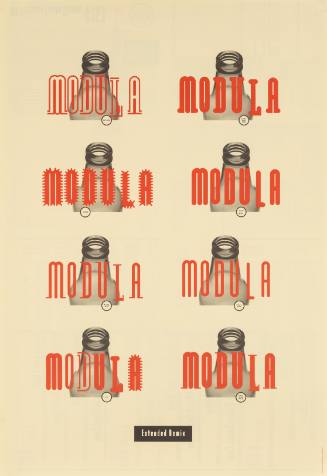
LettError
Netherlands, founded 1989
Artist
Erik van Blokland
Netherlands, born 1967
Artist
Just van Rossum
Netherlands, born 1966
Date1994
Dimensions23 3/8 x 16 1/2 in. (59.4 x 41.9 cm)
ClassificationsPoster
Credit LinePoster House Permanent Collection
Object numberPH.7570
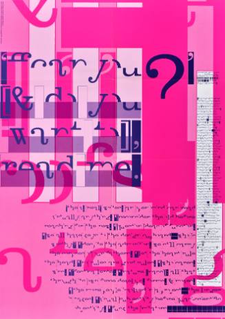
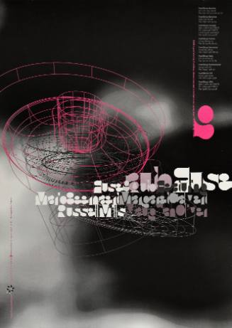
DescriptionAlso included in issue 11 was this poster by the Dutch group LettError promoting a typeface that (intentionally) promises a lot and delivers little. “Inspired by cheap signs on the doors of strange bars in bad neighborhoods,” the digital letterforms reference seedy locations that use fancy fonts and neon lights to lure customers. LettError noted that “we made them look like the stuff other nameless, tasteless people have made in the last 30 years.” Playing on the concept of high expectations versus disappointing reality, the printed versions of each letterform fail to resemble the over-the-top tackiness of the on-screen glyphs. This division between what is shown on screen and what is printed was achieved by combining two different fonts into a single file so that the digital rendering would not match the physical product.On View
Not on view