

Base Monospace
Designer
Rudy VanderLans
born 1955
Photographer
Rudy VanderLans
born 1955
Illustrator
House Industries
Typographer
Zuzana Licko
Czech Republic, born 1961
Date1997
MediumOffset Lithograph
Dimensions32 3/4 x 21 1/4 in. (83.2 x 54 cm)
ClassificationsPoster
Credit LinePoster House Permanent Collection
Object numberPH.707
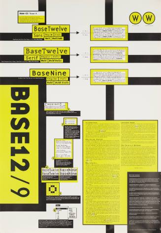
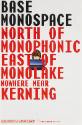
DescriptionRelated to Licko’s previous designs for Base-12 and Base-9, Base Monospace is a variant on the Base typeface in which each letter occupies a space of equal width. As some letters take up more space than others (the letter “m” versus the letter “i,” for example), this results in visually uneven distances between letters. While monospace fonts are commonly considered less legible than those that use proportional spacing, typewriters favored them. As the type- writer was such a common tool, familiarity with how it rendered words ultimately allowed a “difficult” typeface to become universally readable. This underscores Emigre’s belief that legibility is more an issue of frequent exposure than a natural state. Always fans of a good joke, VanderLans and Licko have inserted a pun within the poster by referring to Base Monospace as a place “nowhere near kerning.” Kerning is the adjustment of the spacing between letters to make the text appear visually harmonious. With a monospace typeface, that is not possible.On View
Not on view